
The Best Web-based Data Visualisation Tools
Firstly a disclaimer: I am the founder of Dataseed — an interactive data visualisation platform. I’ve spent a lot of time reviewing the various data visualisation tools on the market and so these are really my personal favourites. I first put together this list as part of a talk I gave at the University of Westminster in 2016 and I’ll aim to keep it up to date.
There is a focus on the more affordable, cloud-based and open products, avoiding the BI monoliths and the niche industry-specific tools. All of these tools are cloud-based and require no coding to use. This selection should be particularly useful for data journalists, analysts, developers and even the causal non-coding user who wants to step up their Excel game.
Criteria
In order to assess which tool is best for our purposes, we need to know something about the ways in which they differ. I’d advise against creating a hideous granular matrix to evaluate features. Instead just narrow down what you’re looking for and then try some tools out. I suggest this as a decent enough high-level framework for classifying data visualisation tools.
Who is the Target Market
- Non-expert Business Users
- Analysts / Statisticians
- Journalists
- Designers
- Developers
- Industry specific — e.g. finance / HR / marketing
What is the Pricing Model
- One-off
- Per visualisation / dataset / dashboard
- Per seat / active user
- Per time used (typically month / year)
- Per volume of data
- Free
Technical Architecture & Scalability
- Client / Server (can be very scalable depending on the server tech)
- Desktop only (limited by the volume of data that can be processed on 1 machine)
- Browser only (limited by volume of data that can be processed in-browser)
Customisability
- Black Box — take it or leave it.
- Open API — possible to integrate with other data sources/viz tools.
- Open Source — should be possible to change anything, YMMV.
Type of visualisations
You really need to have some idea of what visualisations you want to create. Tools tend to specialise. A decent framework for thinking about the available options would be Stephen Few’s 8 quantitative messages:
- Time Series
- Ranking
- Part-to-whole
- Deviation
- Frequency Distribution
- Correlation
- Nominal Comparison
- Geographic / Geospatial
I would also add one to Few’s list — Relationships. Often thought of as graphs / networks.
Key Functionality
- Static / interactive
- Single chart / dashboards
- Embedding
- Collaboration / sharing
- Exploration / presentation / storytelling
- Browser / device support (desktop / tablet / mobile?)
The products
In roughly ascending order of complexity.
Datawrapper — Best for simple single charts
Perfect for quick, single charts to be embedded within your website / blog. Can only handle small amounts of data, but very easy to paste in data from a spreadsheet, choose your chart and modify it’s appearance within the UI.
Target Market — Journalists, blogger.
Pricing — Free to start, €12/m to embed, €129/m — €499/m team plans
Tech Architecture — All data and rendering in-browser, so limited volume.
Customisability — Very good — open source means that you can fully edit the code to customise the charts if you want to.
Visualisation Functionality — Single charts only. Can do all common charts (line, bar, stacked bar, donut, table) and a few less common ones. Choropleth is the only type of map supported.
Plotly — Best for complex / scientific charts
Supremely customisable single charts and static dashboards that can be created through the UI. Ideal for producing complex scientific plots, it has connectors for common data analysis software such as R, Python, MATLAB.
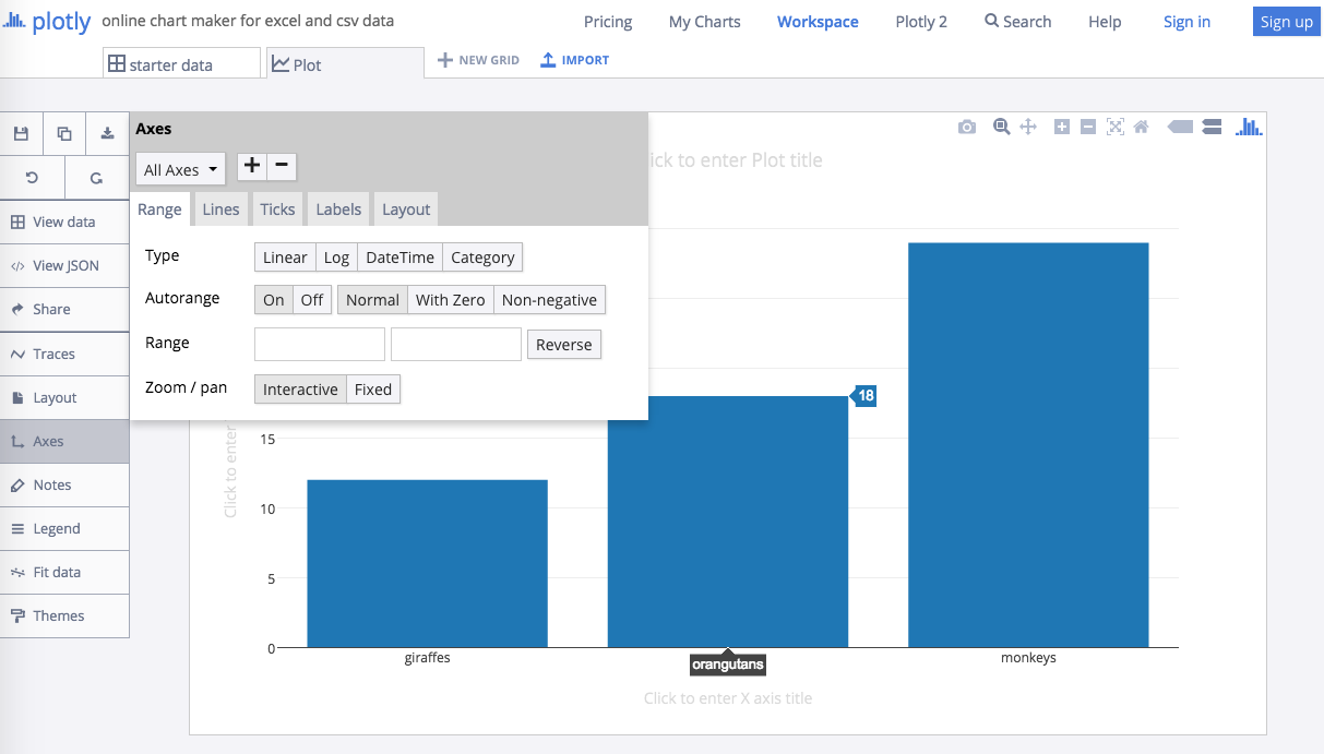
Target Market — Data scientists, Analysts, Developers.
Pricing — Free for public, $19/m for private, $9950/yr for 5 users on-site.
Tech Architecture — All data and rendering in-browser, WebGL and SVG.
Customisability — Very good, open source & API.
Visualisation Functionality — Single charts only, or dashboards that are essentially just multiple charts on a page — no filtering. Really comprehensive collection of charts to work with.
Dataseed — Best for interactive dashboards
Interactive dashboards and data exploration. Simple drag and drop UI to create visualisations. Modern, lightweight platform that can be embedded in other apps.
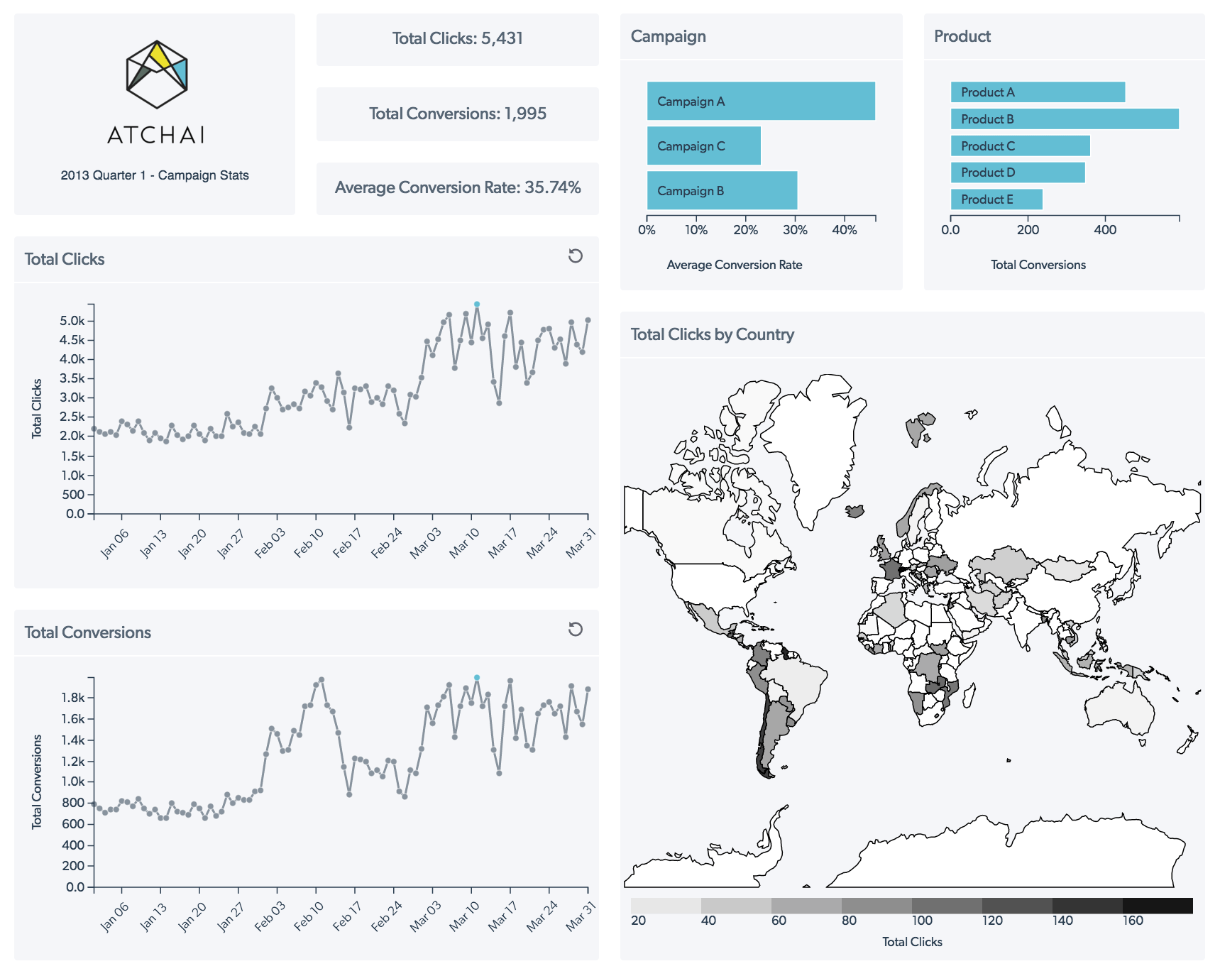
Target Market — Data publishers, SMEs, Non-analyst users
Pricing — Free for public, £10/m private, custom for enterprise / co-dev.
Tech Architecture — Client/Server, very scalable. Cloud or on-premises.
Customisability — Very good, open source & API. Dev team available to help integrate and customise for you.
Visualisation Functionality — Interactive dashboards, where multiple charts are connected. Most common charts including choropleth maps.
Carto DB — Best for mapping
Brilliant for mapping and analysing geographic data. Supports lots of geo data types, and can quickly create stunning visualisations through the UI.
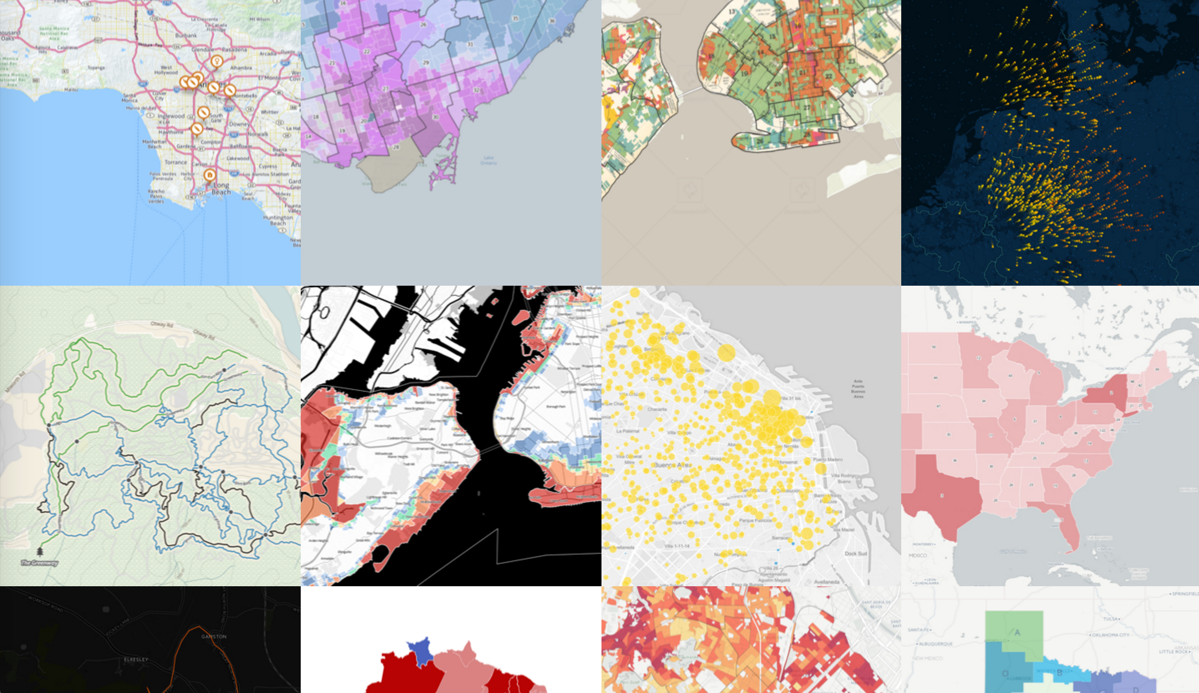
Target Market — Data publishers, Analysts.
Pricing — Free for public, $149/m private, $825/m enterprise starting.
Tech Architecture — Client/Server, very scalable. Cloud or on-premises.
Customisability — Very good, open source & API.
Visualisation Functionality — All sorts of interactive maps — points, lines, polygons. Many base maps available and advanced features such as custom tiles.
DataHero — Best for static dashboards of SaaS data
Self-service BI tool for static dashboards. Connects directly to various SaaS services and can do basic data blending.
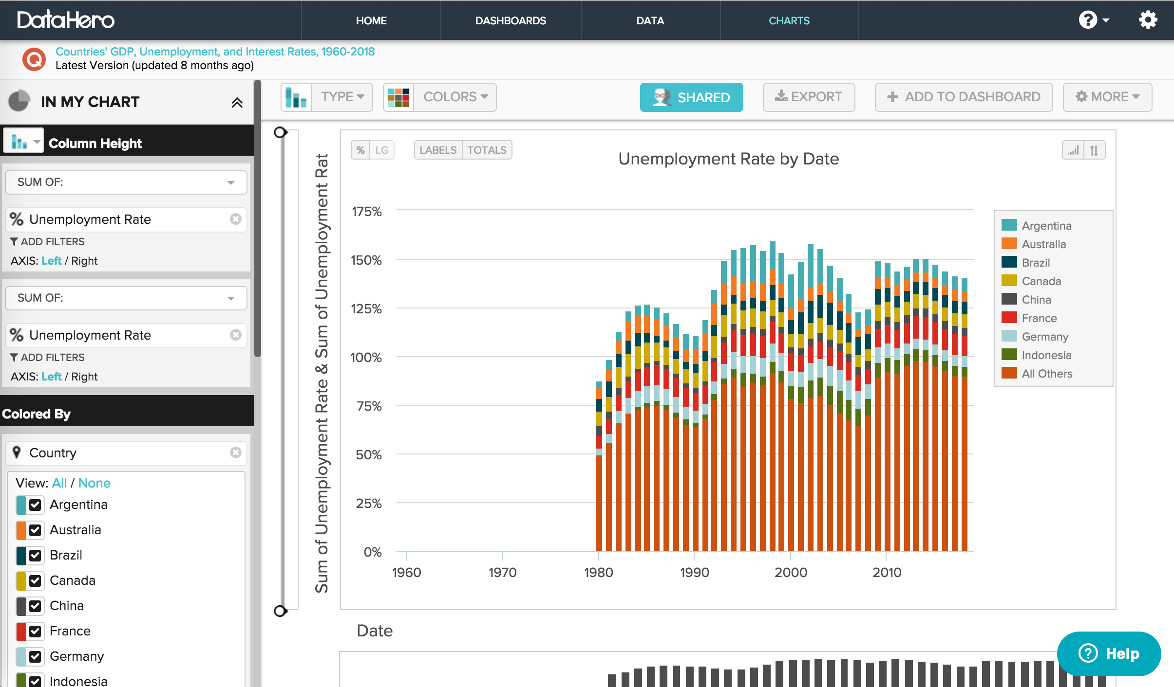
Target Market — Non-analyst business users.
Pricing — Free with 2MB upload limit. Team starts at $89/m, with static dashboards and 20MB upload limit.
Tech Architecture — Client/Server, cloud only.
Customisability — Good enough for most, but not open source.
Visualisation Functionality — Static dashboards, where the charts are not clickable. Most common charts including choropleth maps.
This list is obviously not comprehensive, there are many more web-based data visualization products on the market. It does however represent my personal favourites in each category, the tools I turn to when I need to get something done, fast.
If you’re looking for something a bit different to these tools then our team at Atchai creates bespoke data driven applications incorporating machine learning, data visualisation and all the good stuff. I’d be happy to chat through your project, just send me a mail.